- Популярные видео
- Авто
- Видео-блоги
- ДТП, аварии
- Для маленьких
- Еда, напитки
- Животные
- Закон и право
- Знаменитости
- Игры
- Искусство
- Комедии
- Красота, мода
- Кулинария, рецепты
- Люди
- Мото
- Музыка
- Мультфильмы
- Наука, технологии
- Новости
- Образование
- Политика
- Праздники
- Приколы
- Природа
- Происшествия
- Путешествия
- Развлечения
- Ржач
- Семья
- Сериалы
- Спорт
- Стиль жизни
- ТВ передачи
- Танцы
- Технологии
- Товары
- Ужасы
- Фильмы
- Шоу-бизнес
- Юмор
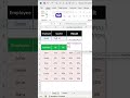
How to Create a Dynamic Data Visualization Dashboard in Excel (XLOOKUP & Conditional Formatting)
Master Excel data visualization with this step-by-step tutorial! In this video, you'll learn how to build an interactive dashboard that automatically updates your charts and highlights data using the power of XLOOKUP and Conditional Formatting.
What you will learn:
Step 1: Use XLOOKUP to create a dynamic data retrieval system based on a dropdown menu.
Step 2: Apply Conditional Formatting with custom formulas to automatically highlight the selected row in your data table.
Step 3: Insert and customize a Column Chart that updates instantly as you change your selection.
Bonus: Learn how to automate your chart title for a truly professional look.
Whether you're tracking sales for smartphones, laptops, or cameras, this workflow will save you time and make your reports stand out!
Timestamps:
Overview of the Dynamic Visualization Dashboard
Step 1: Applying the XLOOKUP formula
Step 2: Setting up Conditional Formatting with a custom formula
Step 3: Inserting and adjusting the Column Chart
Automating the Chart Title for dynamic updates
Final Demo: Switching criteria for instant analysis
Видео How to Create a Dynamic Data Visualization Dashboard in Excel (XLOOKUP & Conditional Formatting) канала Ozzie_Teaches_Tech
Комментарии отсутствуют
Информация о видео
20 января 2026 г. 20:00:00
00:01:24
Другие видео канала