- Популярные видео
- Авто
- Видео-блоги
- ДТП, аварии
- Для маленьких
- Еда, напитки
- Животные
- Закон и право
- Знаменитости
- Игры
- Искусство
- Комедии
- Красота, мода
- Кулинария, рецепты
- Люди
- Мото
- Музыка
- Мультфильмы
- Наука, технологии
- Новости
- Образование
- Политика
- Праздники
- Приколы
- Природа
- Происшествия
- Путешествия
- Развлечения
- Ржач
- Семья
- Сериалы
- Спорт
- Стиль жизни
- ТВ передачи
- Танцы
- Технологии
- Товары
- Ужасы
- Фильмы
- Шоу-бизнес
- Юмор
Exp25_Excel_Ch03_ML1_Airports | Excel Chapter 3 Mid-Level 1 - Airport Passenger Counts | 100% Grades
Exp25_Excel_Ch03_ML1_Airports | Excel Chapter 3 Mid-Level 1 - Airport Passenger Counts | 100% Grades
Contact us:
WhatsApp : +92 3209624776
Email : myitlab800@gmail.com
WhatsApp Direct Link for Chat
https://wa.link/xz3r2a
Exp25_Excel_Ch03_ML1_Airports
Project Description:
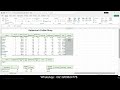
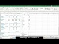
As an analyst for the airline industry, you track the number of passengers at the top six major U.S. airports: Atlanta (ATL), Chicago (ORD), Los Angeles (LAX), Dallas/Fort Worth (DFW), Denver (DEN), and New York (JFK). You researched passenger data and created a worksheet that lists the number of total yearly passengers. You will create a clustered column chart to compare the number of passengers at each airport. Then, you will create a line chart that compares trends over time. Next, you will create a bar chart to compare the passenger count for the latest year of data available and emphasize the airport with the largest number of passenger traffic. Finally, you will insert sparklines to visually represent trends in passengers at each airport over the ten-year period.
Steps to Perform:
Step Instructions Points Possible
1 Start Excel. Download and open the file named Exp25_Excel_Ch03_ML1_Airports.xlsx. Grader has automatically added your last name to the beginning of the filename.
0
2 You want to create a clustered column chart to depict the passenger counts at the six airports over several years.
Create a clustered column chart for the range A4:L10. Cut the chart and paste it in cell A15.
5
3 You want to customize the column chart with a chart title, display the years as a data series, enlarge the chart to be easier to read, and apply a chart style.
•Enter Passengers Counts at Top U.S. Airports as the chart title.
•Swap the data on the category axis and in the legend.
•Set a 3.5" height and 11.4" width.
•Apply the Style 7 chart style. 10
4 The value axis takes up a lot of space for the numbers. You will adjust the value axis to simplify it.
•Change the display units to Millions for the value axis.
•Edit the axis title to display Millions of Passengers.
5
5 You want to focus on the 2023 data series by adding data labels.
Display data labels above the columns (Outside End position) for the 2023 data series only. 5
6 Applying a fill color to the chart area will make the chart visually appealing.
Apply the Light Gradient – Accent 1 gradient fill to the chart area.
3
7 A best practice is to add Alt Text to a chart for accessibility compliance.
Add Alt Text: The column chart displays the number of passengers. (including the period). 5
8 You want to create a bar chart to display passenger counts for only the last year of data.
Create a clustered bar chart for the range A5:A10 and L5:L10 and move the chart to a chart sheet named Bar Chart. 5
9 You want to customize the bar chart.
•Change the chart color to Monochromatic Palette 5.
•Enter Passengers at Top 6 U.S. Airports in 2023 as the chart title.
•Apply the Style 5 chart style.
•Add Alt Text: Atlanta had the most passengers. (including the period). 10
10 Modifying the axes will improve readability of the bar chart.
•Change the font size to 10 for the category axis and value axis.
•Change the value axis Maximum Bound to 1.1E8.
•Change the value axis Minimum Bound to 0.
5
Видео Exp25_Excel_Ch03_ML1_Airports | Excel Chapter 3 Mid-Level 1 - Airport Passenger Counts | 100% Grades канала Myitlab Solution Services
Contact us:
WhatsApp : +92 3209624776
Email : myitlab800@gmail.com
WhatsApp Direct Link for Chat
https://wa.link/xz3r2a
Exp25_Excel_Ch03_ML1_Airports
Project Description:
As an analyst for the airline industry, you track the number of passengers at the top six major U.S. airports: Atlanta (ATL), Chicago (ORD), Los Angeles (LAX), Dallas/Fort Worth (DFW), Denver (DEN), and New York (JFK). You researched passenger data and created a worksheet that lists the number of total yearly passengers. You will create a clustered column chart to compare the number of passengers at each airport. Then, you will create a line chart that compares trends over time. Next, you will create a bar chart to compare the passenger count for the latest year of data available and emphasize the airport with the largest number of passenger traffic. Finally, you will insert sparklines to visually represent trends in passengers at each airport over the ten-year period.
Steps to Perform:
Step Instructions Points Possible
1 Start Excel. Download and open the file named Exp25_Excel_Ch03_ML1_Airports.xlsx. Grader has automatically added your last name to the beginning of the filename.
0
2 You want to create a clustered column chart to depict the passenger counts at the six airports over several years.
Create a clustered column chart for the range A4:L10. Cut the chart and paste it in cell A15.
5
3 You want to customize the column chart with a chart title, display the years as a data series, enlarge the chart to be easier to read, and apply a chart style.
•Enter Passengers Counts at Top U.S. Airports as the chart title.
•Swap the data on the category axis and in the legend.
•Set a 3.5" height and 11.4" width.
•Apply the Style 7 chart style. 10
4 The value axis takes up a lot of space for the numbers. You will adjust the value axis to simplify it.
•Change the display units to Millions for the value axis.
•Edit the axis title to display Millions of Passengers.
5
5 You want to focus on the 2023 data series by adding data labels.
Display data labels above the columns (Outside End position) for the 2023 data series only. 5
6 Applying a fill color to the chart area will make the chart visually appealing.
Apply the Light Gradient – Accent 1 gradient fill to the chart area.
3
7 A best practice is to add Alt Text to a chart for accessibility compliance.
Add Alt Text: The column chart displays the number of passengers. (including the period). 5
8 You want to create a bar chart to display passenger counts for only the last year of data.
Create a clustered bar chart for the range A5:A10 and L5:L10 and move the chart to a chart sheet named Bar Chart. 5
9 You want to customize the bar chart.
•Change the chart color to Monochromatic Palette 5.
•Enter Passengers at Top 6 U.S. Airports in 2023 as the chart title.
•Apply the Style 5 chart style.
•Add Alt Text: Atlanta had the most passengers. (including the period). 10
10 Modifying the axes will improve readability of the bar chart.
•Change the font size to 10 for the category axis and value axis.
•Change the value axis Maximum Bound to 1.1E8.
•Change the value axis Minimum Bound to 0.
5
Видео Exp25_Excel_Ch03_ML1_Airports | Excel Chapter 3 Mid-Level 1 - Airport Passenger Counts | 100% Grades канала Myitlab Solution Services
#Exp25_Excel_Ch03_ML1_Airports #Excel_Ch03_ML1_Airports #Ch03_ML1_Airports #ML1_Airports #Exp25_Excel_Ch03_ML1 #Exp22_Excel_Ch03 #Exp22_Excel #Excel Chapter 3 Mid-Level 1 - Airport Passenger Counts #Excel Chapter 3 Mid-Level 1 - Airport Passenger #Excel Chapter 3 Mid-Level 1 - Airport #Excel Chapter 3 Mid-Level 1 #Exp19 Excel Chapter 3 Mid-Level 1 - Airport Passenger Counts #Step_by_Step_Exp22_Excel_Ch03_ML1 #Exp25_Excel_Ch03_ML1_Airports_Mylab_Solution #Exp25 Excel Chapter 3
Комментарии отсутствуют
Информация о видео
5 октября 2025 г. 13:17:09
00:21:35
Другие видео канала