- Популярные видео
- Авто
- Видео-блоги
- ДТП, аварии
- Для маленьких
- Еда, напитки
- Животные
- Закон и право
- Знаменитости
- Игры
- Искусство
- Комедии
- Красота, мода
- Кулинария, рецепты
- Люди
- Мото
- Музыка
- Мультфильмы
- Наука, технологии
- Новости
- Образование
- Политика
- Праздники
- Приколы
- Природа
- Происшествия
- Путешествия
- Развлечения
- Ржач
- Семья
- Сериалы
- Спорт
- Стиль жизни
- ТВ передачи
- Танцы
- Технологии
- Товары
- Ужасы
- Фильмы
- Шоу-бизнес
- Юмор
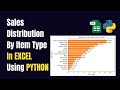
How to Create Bar Chart in Excel Using Python | Full Tutorial for Beginners
🎯 In this video, you'll learn how to create a professional bar chart in Excel using Python and the Matplotlib library. This is a perfect tutorial for anyone who wants to automate Excel visuals using Python for reporting, dashboards, or presentations.
We'll walk you through:
Installing necessary Python libraries
Writing the code to generate bar charts
Adding multiple bar series (Gold, Silver, Diamond)
Adding labels and customizing chart design
Previewing the chart output in Excel
📌 Technologies Used:
✔️ Python
✔️ Matplotlib
✔️ Excel (with Python preview)
This method is simple, effective, and saves a lot of time in report automation.
🔔 Subscribe for more tutorials like this on Excel, Python, and automation tips.
📥 Download Resources: (Link to file if applicable)
💬 Got any questions? Drop them in the comments and I’ll respond!
sales = df.groupby('Location')['Sales'].sum()
sales = sales.sort_values(ascending=False)
#bar chart
x = list(sales.index)
bar = np.arange(len(x))
plt.bar(bar, sales.values, color='orange')
plt.xticks(bar, x)
plt.ylim(0,max(sales.values)+10000)
plt.xlabel('Location')
plt.ylabel('Sales')
plt.title('Sales by Location')
for i in range(len(x)):
plt.text(bar[i], sales.values[i]+500, str(sales.values[i]), ha='center', weight='bold')
plt.tight_layout()
plt.show()
python excel bar chart,
bar chart in excel using python,
create excel chart using python,
python matplotlib in excel,
python excel automation,
excel python integration,
excel bar chart tutorial,
python for data visualization,
excel automation with python,
matplotlib chart in excel,
create chart in excel using code,
excel tutorial for beginners,
python excel tutorial
#PythonInExcel #ExcelAutomation #Matplotlib #ExcelChart #PythonTips #DataVisualization #ExcelTutorial #PythonBeginner #ExcelWithPython #DataWizVamshi
Видео How to Create Bar Chart in Excel Using Python | Full Tutorial for Beginners канала DataWiz Vamshi
python excel bar chart bar chart in excel using python create excel chart using python python matplotlib in excel python excel automation excel python integration excel bar chart tutorial python for data visualization excel automation with python matplotlib chart in excel create chart in excel using code excel tutorial for beginners python excel tutorial
Комментарии отсутствуют
Информация о видео
16 мая 2025 г. 20:30:01
00:07:01
Другие видео канала