Color Theory and Wes Anderson's Style — Sad Characters in a Colorful World
More on Wes Anderson's Color Palettes ►► http://bit.ly/anderson-color
How to Use Color in Film ►► http://bit.ly/color-film
Chapters:
00:00 How Wes Anderson's Style Subverts Color Theory
01:15 Color Theory — Hue, Saturation and Brightness
02:10 Color Bipolarity in The Royal Tenenbaums
03:12 Color Bipolarity in The Grand Budapest Hotel
04:18 Associating Color Palettes with Characters
05:00 Chas Tenenbaum and Red
06:14 When Happy Colors Meet Sad Subjects
06:58 Color Psychology in The Darjeeling Limited
07:34 Final Takeaways on Wes Anderson's Style
08:13 Learn More About Color Theory in Film
Wes Anderson — a filmmaker with a completely distinct visual style (aka the "Wes Anderson Style"), and a director with an eye for color psychology. In fact, of all his director trademarks found in films like Rushmore, The Grand Budapest Hotel, and Fantastic Mr. Fox, it is his color palette that invites the most praise and analysis. In this video essay, we’ll take a specific look at how Wes Anderson often uses a bright and saturated color palette to balance out the darker subject matter of his films.
Color theory (or color psychology) suggests that certain colors have particular characteristics in how we relate to them. The color wheel, in other words, might represent the gamut of all human emotions. In Wes Anderson movies, he doesn’t typically favor one color over another — but he does use color palettes that pop on screen.
In movies like The Royal Tenenbaums, The Life Aquatic with Steve Zissou, and The Darjeeling Limited, the production design is a feast of colors. But considering the subject matter of those films (dysfunctional families, revenge, death), the color palettes don’t quite fit. And that’s the interesting part of the Wes Anderson style — the tone is balanced with contrasting color schemes.
With such bright and saturated fairy tale color palettes, Wes Anderson movies can touch on deep, existential issues without bumming people out. And if it weren’t for the dramatic content, the exaggerated colors would be unbearably optimistic and cheerful. In standard film theory, color in film is usually seen to “support” the tone of the subject matter, but Wes Anderson movies complicate those expectations. This is advanced color theory executed by a filmmaker with a complete grasp of the color wheel who challenges our predisposed notions of color in film.
#FilmTheory #VideoEssay #Filmmaking
—
Music by Artlist ► https://utm.io/umJx
Music by Soundstripe ► http://bit.ly/2IXwomF
Music by MusicBed ► http://bit.ly/2Fnz9Zq
—
SUBSCRIBE to StudioBinder’s YouTube channel! ►► http://bit.ly/2hksYO0
Looking for a project management platform for your filmmaking? StudioBinder is an intuitive project management solution for video creatives; create shooting schedules, breakdowns, production calendars, shot lists, storyboards, call sheets and more.
Try StudioBinder for FREE today: https://studiobinder.com/pricing
— Join us on Social Media! —
Instagram ►► https://www.instagram.com/studiobinder
Facebook ►► https://www.facebook.com/studiobinderapp
Twitter ►► https://www.twitter.com/studiobinder
Видео Color Theory and Wes Anderson's Style — Sad Characters in a Colorful World канала StudioBinder
Показать
Комментарии отсутствуют
Информация о видео
Другие видео канала
 Wes Anderson Explains How to Write & Direct Movies | The Director's Chair
![Ultimate Guide to Camera Gear: Every Type of Camera Rig Explained [The Shot List, Ep 5]](https://i.ytimg.com/vi/heJ9hWNb10g/default.jpg) Ultimate Guide to Camera Gear: Every Type of Camera Rig Explained [The Shot List, Ep 5]
Ultimate Guide to Camera Gear: Every Type of Camera Rig Explained [The Shot List, Ep 5] 'Euphoria' Costume Designer on Matching the Characters With Colors Schemes
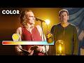 Joker Cinematographer Explains The Impact of Color in Film | Vanity Fair
 What is Mise en Scene — How Directors Like Kubrick Master the Elements of Visual Storytelling
 Wes Anderson and the Follies of Modern Orientalism
 Writing a Meet Cute — From Eternal Sunshine to La La Land, Romeo to Scott Pilgrim
 Dune Official Trailer
 Logan and the Neo-Western Explained — The Evolution of Western Movies
 How To Steal Like Wes Anderson - The Grand Budapest Hotel
 The Difference Between Anamorphic And Spherical Lenses Explained
 Why We're Obsessed with Stanley Kubrick Movies— Kubrick's Directing Style Explained
 Why is David Fincher a Genius? — Directing Styles Explained
 Jurassic Park & the Spielberg Oner — How to Direct a Long Take like Steven Spielberg
![Ultimate Guide to Camera Aperture — What is Aperture & the Exposure Triangle Explained [Ep 1]](https://i.ytimg.com/vi/SOrROvRx-XM/default.jpg) Ultimate Guide to Camera Aperture — What is Aperture & the Exposure Triangle Explained [Ep 1]
Ultimate Guide to Camera Aperture — What is Aperture & the Exposure Triangle Explained [Ep 1] Meet the 2020 DGA Nominees for Theatrical Feature Film
 Limitless Is A Bonkers Franchise
 How To Shoot A Film At 3 Different Budget Levels
 Wes Anderson & The Journeys of Characters