- Популярные видео
- Авто
- Видео-блоги
- ДТП, аварии
- Для маленьких
- Еда, напитки
- Животные
- Закон и право
- Знаменитости
- Игры
- Искусство
- Комедии
- Красота, мода
- Кулинария, рецепты
- Люди
- Мото
- Музыка
- Мультфильмы
- Наука, технологии
- Новости
- Образование
- Политика
- Праздники
- Приколы
- Природа
- Происшествия
- Путешествия
- Развлечения
- Ржач
- Семья
- Сериалы
- Спорт
- Стиль жизни
- ТВ передачи
- Танцы
- Технологии
- Товары
- Ужасы
- Фильмы
- Шоу-бизнес
- Юмор
How To Make Disk Animation With HTML CSS TAILWIND In 5 Minutes | ANIMATIONS
#animation #cssanimation #css3 #shorts #html #html5
SUBSCRIBE: /@knowlogic110
Watch More Website Clone Tutorials: 👉 [ /@knowlogic110 ]
Building a 360° Rotating Design with HTML, CSS, and Tailwind CSS (Including Keyframes)
In this video, I’ll guide you through creating an eye-catching design using HTML, CSS, and Tailwind CSS, with a special focus on adding a 360° rotation effect using CSS keyframes. I’ll walk you through setting up the design, applying utility-first Tailwind classes, and then adding animations that allow your element to rotate smoothly while maintaining its full shape. This tutorial is perfect for anyone looking to enhance their web development skills, and I’ll also provide the code in the description so you can follow along and implement it easily in your own projects. Let’s dive in and build something amazing together!
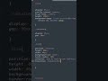
Here’s the code without angle brackets:
html
head
style
@keyframes spin {
100% {
transform: rotate(360deg);
}
}
/style
/head
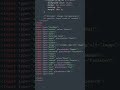
body class="bg-gray-900 flex items-center justify-center min-h-screen"
div class="flex items-center justify-center transform rotate-20 skew-x-[-5deg] skew-y-[-20deg]"
div class="w-36 h-36 bg-pink-300 border-4 border-black rounded-full flex items-center justify-center animate-spin" style="background: conic-gradient(#ffffff, #f5e1f6, #ffefd1, #fefec5, #c8c8c8, #8a8a8a, #605859, #704864, #3b49ac, #31c8de, #6cd399, #d0d0d0, #fcfcfc, #ffffff, #ffffff, #eafae9, #a3ffef, #98bcea, #9997a4, #868686, #767676, #f0ed5b, #e2a3a7, #d4d4d4, #ffffff, #ffffff);"
div class="w-12 h-12 bg-white border-4 border-black rounded-full" /div
/div
/div
/body
/html
Видео How To Make Disk Animation With HTML CSS TAILWIND In 5 Minutes | ANIMATIONS канала KnowLogic
SUBSCRIBE: /@knowlogic110
Watch More Website Clone Tutorials: 👉 [ /@knowlogic110 ]
Building a 360° Rotating Design with HTML, CSS, and Tailwind CSS (Including Keyframes)
In this video, I’ll guide you through creating an eye-catching design using HTML, CSS, and Tailwind CSS, with a special focus on adding a 360° rotation effect using CSS keyframes. I’ll walk you through setting up the design, applying utility-first Tailwind classes, and then adding animations that allow your element to rotate smoothly while maintaining its full shape. This tutorial is perfect for anyone looking to enhance their web development skills, and I’ll also provide the code in the description so you can follow along and implement it easily in your own projects. Let’s dive in and build something amazing together!
Here’s the code without angle brackets:
html
head
style
@keyframes spin {
100% {
transform: rotate(360deg);
}
}
/style
/head
body class="bg-gray-900 flex items-center justify-center min-h-screen"
div class="flex items-center justify-center transform rotate-20 skew-x-[-5deg] skew-y-[-20deg]"
div class="w-36 h-36 bg-pink-300 border-4 border-black rounded-full flex items-center justify-center animate-spin" style="background: conic-gradient(#ffffff, #f5e1f6, #ffefd1, #fefec5, #c8c8c8, #8a8a8a, #605859, #704864, #3b49ac, #31c8de, #6cd399, #d0d0d0, #fcfcfc, #ffffff, #ffffff, #eafae9, #a3ffef, #98bcea, #9997a4, #868686, #767676, #f0ed5b, #e2a3a7, #d4d4d4, #ffffff, #ffffff);"
div class="w-12 h-12 bg-white border-4 border-black rounded-full" /div
/div
/div
/body
/html
Видео How To Make Disk Animation With HTML CSS TAILWIND In 5 Minutes | ANIMATIONS канала KnowLogic
Комментарии отсутствуют
Информация о видео
10 ноября 2024 г. 10:42:47
00:04:30
Другие видео канала
 Junior Developer vs Pro Developer | HTML TUTORIAL #shorts
 Junior vs Senior Developer | HTML CSS
 Mobile Design | HTML CSS TAILWIND |
 Futuristic Login Form HTML CSS #login
 Login Animated Form | HTML CSS #shorts
 Netflix Clone using HTML, CSS & TAILWIND
 Beginner vs Pro developer | HTML CSS #shortsfeed
 Junior vs Senior Frontend Developer | HTML Tricks | Css Tricks #shorts
 HTML CSS Animation Icons | HTML CSS TAILWIND
 HTML CSS Tricks | All Input Types | Frontend Developer
 Create a Animated Login Form with HTML & CSS | Step-by-Step Tutorial
 Noob vs Pro Developer | HTML CSS
 HTML Selectors | HTML CSS #shorts #html #css
 Mobile Animation With HTML CSS | #webdesign #webdesigning
 How to Build a Netflix Clone Landing Page Using HTML, CSS, and Tailwind CSS #html #css #tailwindcss
 Noob vs Pro Developer | HTML CSS
 How To Design Battery Charging Animation Using With HTML TAILWIND CSS | Battery Charging Animation
 Junior Developer vs Pro Developer | HTML CSS
 HTML Radio Buttons | HTML CSS
 CSS Trick | Junior vs Frontend Developer | Tricks Videos
 WAIT FOR THE CSS | HTML | TAILWIND | MOBILE DESIGN